Home Styling & Interior Design
At EMC Relocations, we are passionate about getting you settled into the house of your dreams. It can be great fun redesigning the perfect living space for your family. Why not trust the home interior specialists that we liaise with to help you realise that vision? From modern to exotic, sophisticated to funky, we want you to enjoy this part of your relocations experience, and be happy in your home during your time in Indonesia.
Ambre from Interiorology (https://www.interiorology.com.au/ ) has put together a summary of the big trends in 2021:
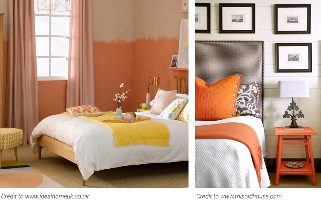
Bright colours
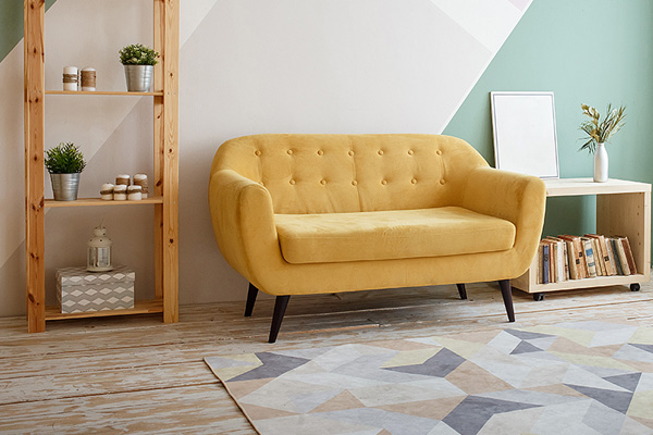
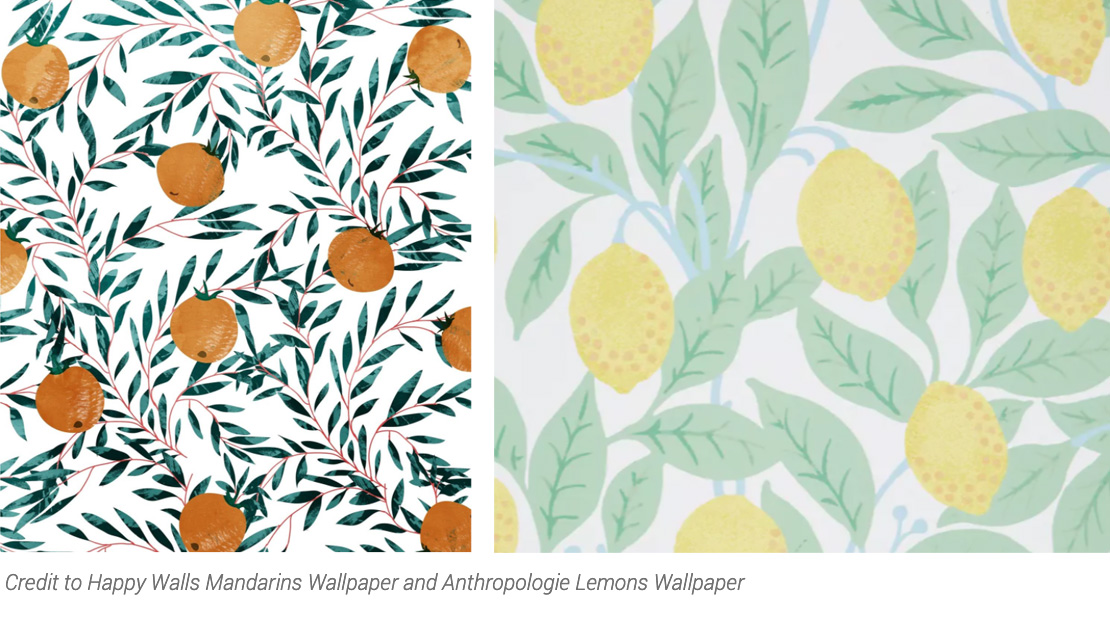
A contrast to endless palettes of white and grey, 2021 sees the return of bright colours, particularly yellows, oranges and greens. From bed covers to bright walls and sofas, these colours are everywhere. Linked to them are motifs of lemons and mandarins which are making a return via home accessories, wallpapers and furnishings.
For most of us, these bright pops are likely to only feature as accent colours – brightening up a more neutral palette rather than dominating the room. However, if you are feeling a bit braver, then apply these colours more liberally. Using the 60/30/10 rule, flip the dial and turn 60% of your room into a haven of yellow, orange or even green, while applying whites, creams and other neutrals to the remainder of the room.
1970s Retro
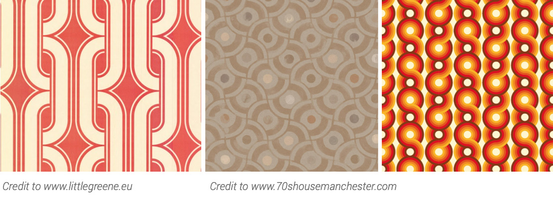
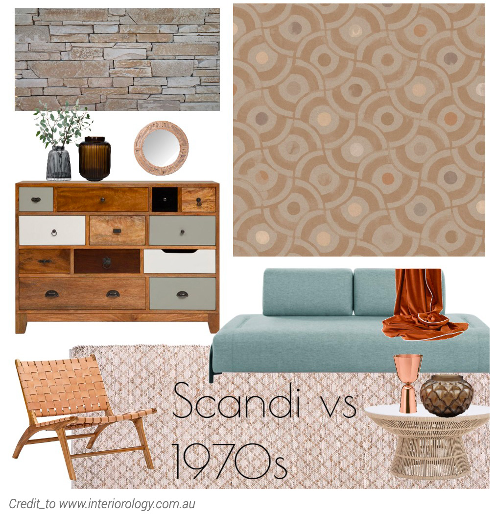
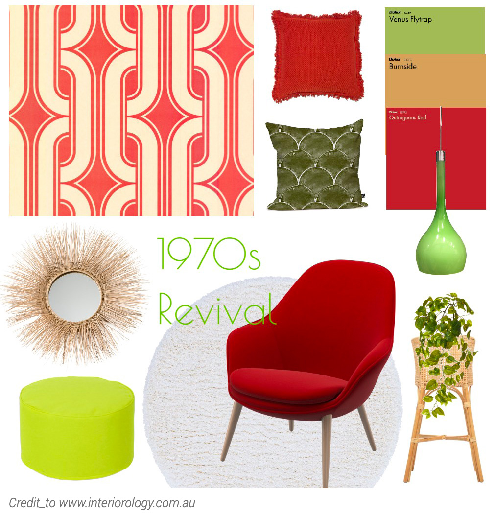
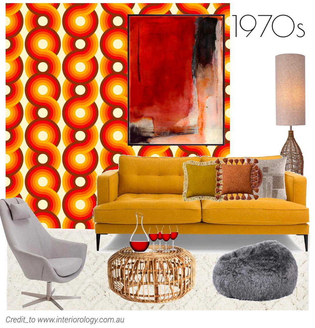
Related to a return to bright colours, we are seeing a clear re-birth of 1970s styles and decor. No, not brown! There is more to the 1970s than brown corduroy I promise!
Beautiful retro 1970s wallpapers with bold prints, velvet-looking sofas in bold bright colours, and an abundance of greenery within the house are all nods to a decade that some say “fashion forgot”.
Modern Victorian
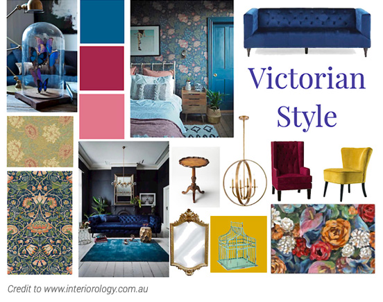
An off-shoot of sorts to the recent CottageCore trend, Modern Victorian is really taking off in 2021.
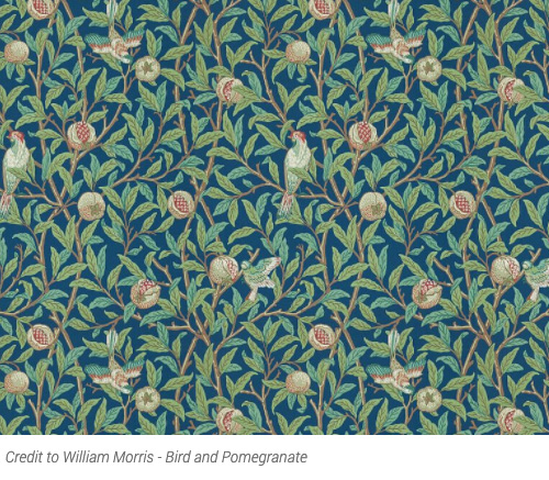
Think beautiful textiles and accessories that mimic the Victorian era (such as those from famous textiler William Morris), this style employs layering and colour to create a sense of warmth and old world luxe.
The antithesis to mass-produced neutral decor, this style embraces detailed patterns that look and feel bespoke (even if they are not) and takes us to a slower time, when decor items were individualised and made by hand.
A perfect excuse to hit flea markets, or feature some of your family’’s cherished heirlooms, this style encourages an eclectic feel. To add a modern touch, team with ultra-modern furniture such as an occasional chair or create a feature wall painted in a shade of beautiful ruby, emerald or sapphire.
Yellow and Grey
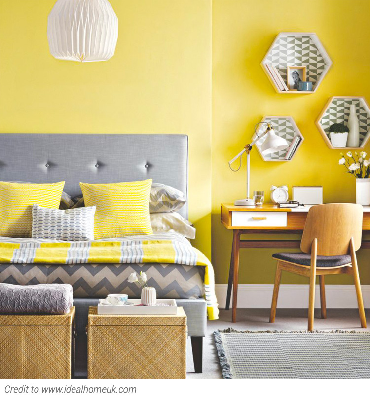
One half of Pantone’s Colour of the year, Lemon Yellow is definitely having a ‘moment’. Lemon yellow is one of those colours that suits both a masculine and feminine room, and can be used as both a dominant or accent colour. Because it is paired back compared to brighter yellows, it does not overwhelm the eye, but still provides a real pop of optimism and happiness to any room.
Grey on the other hand speaks to strength and stability and works well with homes that still retain large swathes of grey from previous decors.
Paired together, and we have a timeless (if not slightly 1980s) palette that somehow looks both cool and warm at the same time. The two colours can be combined in equal measure or with one acting as an accent with the other taking on the dominant role.

Natural textures
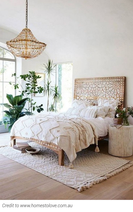
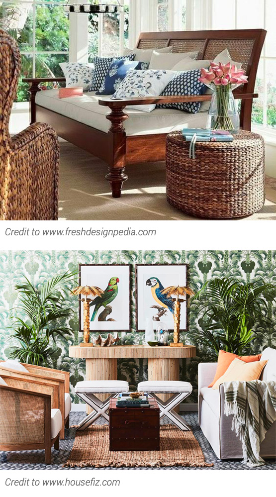
Natural textures such as cane, rattan and jute provide warmth and strength to any decor.
As this trend continues to take off, we are seeing more and more home furnishings in these materials.
Resilient and textured to the touch, they can be used to create a more relaxed feel (think beach house) or a more glamorous feel (think British Colonial Style). The possibilities are endless.
Chain store or bespoke, there is no limit to the way in which you can apply this trend. Think a beautiful rattan bedside table or buffet, coupled with jute or sisal rugs and fresh flowers cut straight from the garden. Gorgeous!
Ocean vibes – Aegean Teal
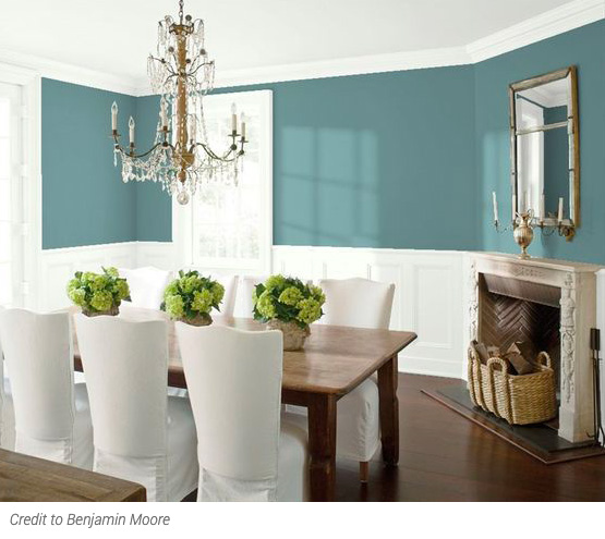
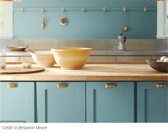
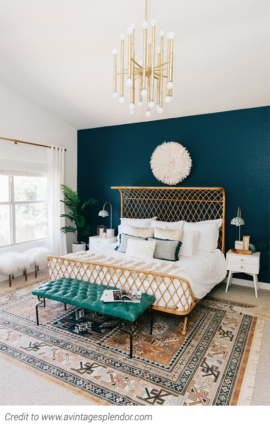
Influenced by Benjamin Moore’s 2021 Color of the Year, Aegean Teal, this timeless colour reminds us of tropical holidays past (and hopefully holidays that we will enjoy again before too long!).
More muted than other teals, but fuller in colour than some of the muted greens we have seen in recent years, this colour group warms us at the same time as sending our thoughts to cool waters, Coupled with a neutral or natural palette (think Scandi) this colour provides a perfect tranquil pop to any room.
